A WW1 recipe food book for children in school and at home.
- A book cover design - front and reverse pages and spine - size and fomat to be divided by me based on research.
- double page spread design - size and format again up to me - needs to be synch with the cover design.
- add any additional features
- work sheet design - single page link to each spread design with task and games that children can personalise with name and school etc.
- PDF version is key.
- high resolutions.
- A2 mount board with a scaled down print out from my PDF file. everything must be label.
- show my work on many medias like tablets and phones.
Listed Of Research
- sized of children books, with inform about food themes (front, back and spine) = this should everdence my final design outcome.
- the links between the pages and cover, how they synch.
- how double pages are laid out.
- type
- imagery
- add on, anything that can be different to others.
- work sheets with school (all ages)
- audience (children and their teachers and parents).
- children's ebooks.
- family social media, and schools
Background
the project is about activities that take place to commemorate the WW1 to a range of people engaging with the history of the conflict. A village school has put in a bit entitled discovering the WW1 home front in Hempsted : children and charities, food and farm. it will involve the school and community groups in activities and events, the great blackberry pick, which school children took part in during WW1 picking fruit to be made into jam for the soldier is intended to be a hook interest children and community in both food in wartime and in the children wartime activities.
the outcome of this project is to productions a range of resources for schools which will be able download from websites including a WW1 cookery book - booklet for children in primary school. this aim is to include approximately 8 -12 recipes and each page should include relevant imagery plus chosen recipe and supportive background informations and or fun facts.it is intended each student's cover / reverse, recipe spread of the book can be downloaded on their own as a PDF. they also intend that we can put selected work together as a PDF e book or as a individual hand out in a class room.
Audience
Being a young audience and children with primary school level. So needs to be clear and creative.
Audience
Being a young audience and children with primary school level. So needs to be clear and creative.
Timeline
- 23rd feb - brief handout
- 9th mar -thumbnails and concepts
- 20th apr - prototype
- 27th apr - peer assessment
- 11th may - hand in
Research
History books cover
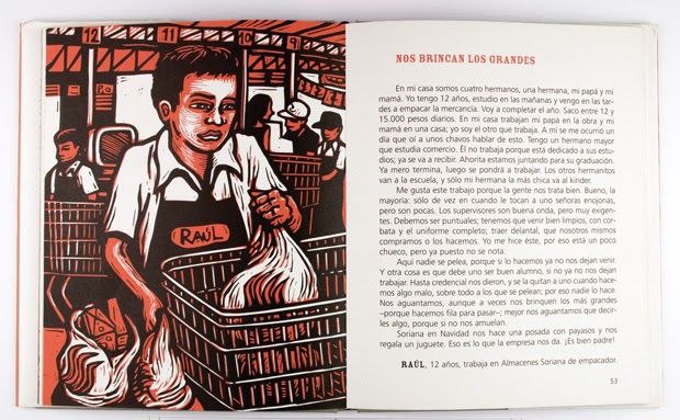
Key Stage 3 History by Aaron Wilkes: Technology, War and Independence 1901-Present Day Third Edition Student Book Publication date: 26/02/2015 and two other books of his shown below, Publisher: Oxford University Press, Age range: 11-14 years. As his design and book are new only being published this year I was interested to see how informative books have change since i want i child, his colour seems strong within his design and his illustrators are detailed but not over wleming, with each book holding a different colour its much more that an informative book but somewhat fun. His is very finding, as he does history books i see his typeface to be representable of profession leaning and history - if he used a modern type it would work as well, and its constance within all his books which is a nice touch as children will recognise, he also uses all the space within a way of not over filling page - it modern with not over filling it, it has all the informations that is nestsy and intriguing. (found on amazon books). The size of this book is A4, its easy to read and pick up, not very thick.


Stories of World War One by Published March 31st 2014 by Orchard. I do love this design, its mixed of sun set oranges and yellows and the bold black silhouettes and really brings out the caplet lettered title. The silhouettes are very common when it comes to History as it shows a ghostly memory of someone, its defiantly liked within world story books, showing the uniform. The font is very straightforward, not to modern but also not very old school - this maybe because its easier to read and to keep more of a centenary theme. (found on amazon books)

Food books covers
Food and Cooking In: Viking Times by Clive Gifford Published: January 1, 2010 Publisher: Hachette Children's Group. This book is very much like the idea we have to do, but of viking times, its colourful design and simple illustrator are very key to attract children. Its a great way of mixing history with cooking and its viking style typeface is differently but very much linked with content. Its colours are very nature and friendly which deferentially a good thing to have with a children's book. (found on amazon books) This book is also A4 which seems to be a common size.

30 Yummy Things to Bake (Usborne Activity Cards) by I grew up with a similar book, its simple design is great for easy to do recipes for them to do with and within parents. I remember its simple lay out being a key component of why i liked the book, easy to read and follow. This being a girly style book is shown within its feminine colours like yellow and pinks plus with its bubble hand done typeface I also see a feminine side. With a mix of photography and illustrators its a really fun book for young girls to follow well leaning baking. I really like the mix of photography with illustrators defiantly something i think is good to have within a food book, seeing what your baking with an actual image is better for them to understand. (found on amazon books). bigger that A4 this book is a clear readable book. bigger that A4

Archie's War: My Scrapbook of the First World War, 1914-1918 by Marcia Williams, This cover is very expresent of its content - its story of a young lad is shown within a dairy book design added with the typeface being hand down and un smart, with his name and photograph its a personal insight feel that children can understand easier, I feel this design really represent wells and its little colour adds to the effect of its age. Red being a powerful colour and yellow and cream being very personal dairy style.
http://www.the-best-childrens-books.org/world-war-1-books.html
 |
Growing Up In World War Two: Food by Catherine Burch Published by Franklin Watts, 2009. I really hate this design! I understand that photography is the best way to everdance anything but this design isn't clear. with the 2 different type of tone black and white images and the full on primany colours for the title I have become eye pain from looking at it, i find this exsteamly old fashioned, unwelcoming and design disgraceful. Seeing this design has made me think about how to uses photography in the right way for this project - this isn't the right way! simple and limited colours are key to shows cleanly content. (found on amazon books) A4

Famous books
Dairy of a wimpy books are very poplar at the moment. Its simple lay out of dairy style with embrasing story lines and simple but funny cartoon stick figures. Its shows that you don't have to design something to busy and crazy, something simple is better. With hand done design from font to imagery. Its very relatable for students to read - getting the relatable connections to children is good way of getting them interested so maybe a dairy theme or work book in the WW1 time style could be more understandable and creative that a boring history book style.


Cover, back and spine
I love this design because of its link within the colours, the blue font on the front matching the blue background on the back. Its little simple details make it clear - with only 6 colours used and 3 (red,yellow and blue) being the common dedonanater its not distracting. tho there are a lot of black spaces on this design its a common theme all these books (dr Suss) tended to have. Tho I feel the colours are too bring and could have been chosen better like lighter and soft its also a common theme this author has.
http://xserve.sunyit.edu/~steve/dcrit/DCrit_Beta.html

This design shows the best way of using the spine as a big feature, its fun and creative way is good of making sure the reader looks and studies the cover completely, its almost romantic especial with the sultan colours and the over powering black that links the two figures and have the writing drift around them adds to the smooth and calming / mystery feel.
http://www.sritejareddy.com/selfpublishing-articles-to-help-you-realise-your-dream/5-steps-to-designing-your-book-cover

The wonderful wizard of Oz - is a classic book that is loved, this design on the other hand its liked at all in my eyes. Its badly sized and placed title its colour is harsh and i feel this doesn't work at all. 3 tone colour only works when the colours are hormonal.
http://www.rareozbooks.com/rare-childrens-books.html

Spines
Often the spine shows the title and author but the add of an image / illustrator can also be involved. colour seems to be important - do you continue the colour round from the cover or add a strip of new colour that maybe involved else where on the cover. Its something i'll have to think about when doing my sketches and playing about in Indesign.

Victorian children book
The Victorian children books where often very image based, often dividing text with eched drawings with little or non colour. Consider this is a WW1 book I though looking into Vicorian books maybe good for creating a vintage style with type but redo the illustrators and replace with black and white photography.


Typography for Children
Many things need to be considered when picking the fonts of a children book, colour needs to be crisp and bold so its easy to read - if its too light of a colour on a white background it would be visual recognisable for the children's still developing eyes. Bold colours is find for title and side facts but I feel you can go wrong with having black body font for a clear readability.
Typography for Early Readers by amy Burrell talks about limiting the number of fonts keeping to 2 different typeface only - tho you want to be creative you also need to clear and non confusing, too many can look messy, she suggest a san serif for the bold and a a different one for titles - like i though. she also talks about size of the text depends on the audience age - never got smaller that 12pt and for children's books its fine to go 14 -18pt. its important that the type is big with lots of white space so the children can read is easier and slower that adults. Also do not hyphenate any words, as the reading level does not necessarily understand hyphenation yet and it is also a messy way to display your text. Stick to black text on white background, This is the main way we learn to read so it is easier for a child to switch into reading mode when the text follows this colour combination.
http://childrensbookcreation.blogspot.co.uk/2011/05/typography-for-early-readers.html

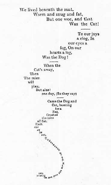
Be creative with type is great for children to see thing in a different way - this Meow image makes me laugh, it becomes a puzzle as well as something to read. As long as its layer out right children can easier follow it.
http://www.designofthepicturebook.com/tag/typography/

Popular San Serif Typefaces:
1: Futura: an all-purpose typeface prized for its efficiency and sharpness, it inspired a proliferation of geometric fonts after it was released in 1927 and remains one of the most popular fonts in publishing and graphic design
2: Myriad: the typeface of choice for many internet giants, including Google, Linked-in, Mashable, and, most recognisably, Apple’s iPod, Myriad is ideally designed for text destined to be viewed on a screen
3: Helvetica: possibly the most commonly used typeface by graphic designers around the world for its clean simplicity and legibility, Helvetica is a good choice for information rich books with a serious or neutral tone
4: Franklin Gothic: often referred to as the American Helvetica, Franklin Gothic is a slightly heavier typeface most recognisable for its use in Scrabble tiles but also extremely popular in magazine headings and gallery catalogues
5: Univers: with clear lines and distinctions between characters, Univers is an extremely legible typeface that is often used for school exams and other publications where clarity is important
https://fictionetal.wordpress.com/2012/09/11/self-publishing-part-8-the-wisdom-of-fonts-10-book-typefaces-that-cant-go-wrong/


Imagery
There are many different ways of creating imaginative imagery for children's books like photography but mainly illustrator is key within all styles. In Children’s book picture play a big part of story telling. Picturebooks: The Art of Visual Storytelling, illustrator evolution of the picturebook as a storytelling medium and a cultural agent. Often images are places on one page and the writing on the other but shape and grip systems can be used to break the writing up, plus there is just idea of having the image on full page and adding writing in the spaces to fill the page. Also the writing can be used as a image shaping it round outline of something like in the image below its a mouse tail. With the WW1 book being a really informations based, imagery can really display the info in a fun way and it will be spread out within a grid. Photography is great for cooking books but history books are very much bolded and due based (but its illustrators can be fun and detailed) adding drawings for them really can be fun and interactive. I defiantly need imagery but i need to look more into depth of what needs to be in the book before planning layout and planning picture style.


Double page layouts
This design shows the fun you can have with space layout, not following a boring layout this design leads the eye to move about the informations freely and not over powering with informations. You can take the information's in what ever directions the reader whats. Its colours are simple but linked together and the title typeface is fun and the informations typeface is readable and clear - which is the main key.
http://www.mercerdesign.com/mercer-design-client.php?client=Natural%20History%20Museum&lang=en

This double page book design is divided well with illustrators but i feel the writing could be divided too and the title font could have been wilder - something taller and bolder. Its colours are great for attractions but the lack of detail in the tree isn't constant with the "tigger" drawing which is detailed - this shows be that little details can make a difference. I must remember when designing to link everything together and is should be constant.
https://www.behance.net/gallery/1440985/Childrens-Book-Layout

This design works really well within attractions of getting children cooking, the yum photos shows what they could look like, this is very poplar in cooking books. Its 6 step easy to follow design is simple layout of 3 grid system and the constant theme of orange and blue is a good link within this design. Its common theme and good presentations is defiantly a good design.
http://www.denisesmart.co.uk/books.html

This design again uses a simple 7 step follow along and its shown threw illustrators again simple hand done drawn diagrams. Plus like the one spread above its linked together with 3 tone colour system of white, red and blue - seems a common thing to have and may consider it within my design.
http://www.emmalathamdesign.com/childrens-publishing/4577165084

Woodroffe -Free teddy book mark, I love the soft illustrators


Hide and Seek Bunnies, hided images and children having to find them


Sizes of children books
From looking at my research into books a common size of teaching and informative books in A4 - easy to read for a primary school level, and can't get lose.

Links within the front page and inside layouts
Within this book called the children's chocolate cookbook, its links are within cover and pages inside are within the typeface for tiles and names and the images are layer out the same within the space, i like show they over lay, it really shows a cooking work environment with everything laid out like in a kitchen its very playful and realistic for children, making a mess and using everything in the kitchen plus the strong use of photography is easy for children to understand. showing the ingredients and final made piece is exciting for children to think of doing. Also the use of colour within this book is strong suggestion of a girl audience - with using pastel colours like yellows, soft pinks and green and baby blue its a very friendly design that is welcoming for all ages.
http://www.usborne.com/catalogue/book/1~C~CCS~5988/childrens-chocolate-cookbook.aspx


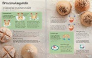
This design below for the children's book of baking bread uses the same idea of typeface being the same and lay out of photography images that start at the book left page and end at the top right, its concision within all the pages that the images are like this and the recipe and little illustrators are fitted round the images - this shows that imagery plays a big part within cooking books and its defiantly a key need to get children involved. Again the books are soft and welcoming but this time they are less females based, maybe fined the right colours for my cooking book would need to be linked within the war? or children? like these 2 books already, strong use of soft colours like yellow,pink,blue and green and welcoming to all sexes and ages.
http://www.usborne.com/catalogue/book/1~C~CCB~8818/childrens-book-of-baking-bread.aspx


This design is from on old vintage cooking book for children, its 3 tone colour screams its ages but as I'm design a book that is from the WW1 maybe a vintage style would works, no photography but a simple 6 grid system is easy to follow, its design is only linked within typography and illustrations drawing designs. Tho the illustrations design is boring and un - interesting for children of new its idea of 3 tone colour is defiantly bold and something i may consider.
http://toriavey.com/toris-kitchen/2013/10/popcorn-balls/


Food photography
Showing the ingredients is often used within food and cooking photography, often in a kitchen environment which is messy and almost vintage, with wooden counter tops and very country house feel props. Often close ups or birds eye view the photos are taken, its a clear view, maybe i could incorporate space for the recipes when taking the photo, so the photo is the background and a part of the photo.
I really like the messy envierment with flour and sugar spread around, looks very real, also this is a simple GIF image, maybe it could be an idea for there ebook or anything they choose to do online.


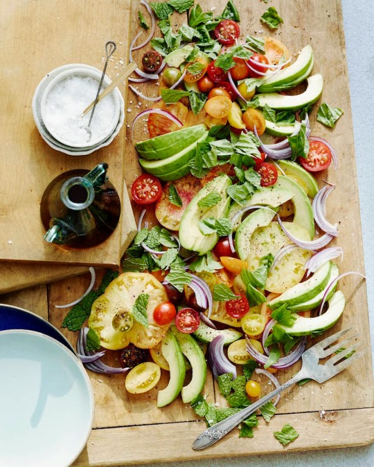
I love this idea of not using a plate but material, this is something that would work with the theme of 1910's age, a strong image of the finished food is where i think the more detail the better, its about conniving the audience to make this tasty food and trying the recipe.


Activities
http://www.gloucestershire.gov.uk/archives/article/116759/LessonJ4JJJFruitJandJNuts!


Being creative isn't something I've seem in my research for worksheets - simple, lined drawings, no more that 3 grid, outline drawings, finish sentence - games.
I feel there needs to be colour and more of a creative lay out. i don't want it to be boring but fun and modern but not in a cheese way.


I prefer this idea below as its more interactive and fun, its more welcoming... i don't think it's just because of the colour, its not over filled with info and task - its more image based with a detailed illustration.

Reward charts are a great way of getting children excited for finishing something. Within school class mates or family members creates a health compositions. Would work well within school and homes lives. Rewards could be a sticker (which is very poplar currently) and maybe if they do all recipes they get a free cooking item like sponges or rolling pin.


Adverts for parents
Using a children's characters from tv and books its directing the message straight to the buyer of Marmite its getting children and the parents interested - very nauty way shown threw vandalism its still very fun and creative. (as longs as kids don't do the same). Using illustrator characters its a reminder of the shows / books and its theme of "horrid" with the books / tv is also like Marmite. Love to hate both. Really like the realistic idea of children being nauty, many doing a diary version of the WW1 book would work.

http://www.theguardian.com/media/2009/sep/09/marmite-kids-characters-adverts
The well known Christmas advert for John Lewis fectured the well known characters the bear and the Hare WE'RE PUBLISHED IN THE BOOK 2013. ITS THE ADVERT ALONG WAS FAMUS BUT THE BOOK SALES WHEN THREW THE ROOF WHEN THE ADVERT WAS REALISED AND ITS BECAME AN NOVELTY TO HAVE. ITS FAMUS STORY AND ADVERT ARE SEEN AS A CHRISTMAS THEME - EVERYTHING ABOUT THIS BOOK, ADVERT AND SONG BEAME FAMUS OVER NIGHT - A CHRISTMAS CRASS SOUNDS THREW HIGHP. ITS ALSO CAN BE SHARED THREW TV - SOICAL MEDIA - EBOOKS - EVERYTHING - ALL AGES. i also really like the links round the image, it frames is well, maybe something to add in my wokr

http://www.johnlewis.com/inspiration-and-advice/az-of-christmas/bear-and-hare
Often the adverts for books for parents to buy it aims at the price - as children grown and develop fast the book level changes but without improvement like better books they don't get better level- so parents want good values for money before they grow out of it. Many online adverts aim at this from pushing collections and deals the saving over 80% when shopping online -(giving the effect of a good deal but probably isn't any different to in shops). Hitting them clearly were they need to be hit - money savings - there children's development - clearly selling point and product.


Other add ons
I love this idea of a free gift to give away that help and encourages theme to use the cook book and gift. This idea for a gift would be great if they can afford it but this could be costly - maybe a composition would be good for winning some cooking stuff, and maybe schools get one free.

A free gift is great especial if its linked like this boat bath toy is great with this book and its fun for play and getting them to read the book. - love the idea of linking it and having fun with it - doesnt have to be a cooking item but many a war toy?

http://www.apartmenttherapy.com/10-perfect-pairs-gifts-to-accompany-childrens-books-203060
Maybe an idea of giving about the audio version of the book like as a cd or download -or a discount to get the ebook versions or a different book discount. Its a modern way of keeping with the times. I feel this idea really could work for them - school may really like this idea too as it gives a chance for dyslexia children to understand - being dyslexia my self i do remember have a tape with a book and i loved trying to read along side the tape - good for children's development.

http://www.theworks.co.uk/p/children-s/toy-story-book-cd/9781445476049
Stickers
Stickers are a great way of interesting children, giving one free within the book or activity sheet would be a fun way of getting them more interested. Its defiantly something i'd like to add within my designs, its fun and creative for the children.


Cartoon designs


Ebooks
With ebooks being more and more poplar these days due to easy usability and hardly any cost its no wonder their wanting is grown, especially for children's picture eBooks and for complex non-fiction like cookbooks and textbooks. Unlike standard reflowable eBook files, fixed layout eBooks can keep the same page layout and design as their print book counterparts, and can sometimes contain enhancements that make them more interesting and interactive.
Children’s eBooks are a popular topic right now in the publishing world, not only among publishers, but also among independent authors. While it is difficult to gain any traction in the children’s print book market, eBooks are a more level playing field. Many independent authors are writing and illustrating their own books and obtaining good sales rankings right alongside the major players.
Here are some of the key features that are available in children’s eBooks in iBooks:
- Full-page zoom: While other fixed layout formats do not allow the page to zoom in or out, iBooks allows the reader to zoom into the page to see image detail better or interact with smaller enhanced elements.
- Single-page view: Zooming allows readers to view only one page at a time instead of the standard two page spread.
- Orientation rotation: Readers are also able to rotate the orientation of the book to landscape or portrait. If you prefer, that feature can also be manually set in the code.
- Embedded media: Fixed layout files are regularly enhanced with video and audio content.
- Animations and interactivity: There are some really great options for animations and interactivity in iBooks.
- Narration overlays: This integration between text and narration are currently almost completely limited to fixed layout files, and we recommend this functionality be added to all children’s eBooks if possible. iBooks also allows you to make the text change color in time with the narration.
http://ebookarchitects.com/learn-about-ebooks/childrens-ebooks/


children's Ebooks for tables and mobile
Ideas and Development
sketches


illustrator designs
Inspired by Key Stage 3 History books by Aaron Wilkers - the bold colour and transparency type face effect look modern but the bold font being Times and the black binding look adds to the theme of an older look. its mixed of old and new isn't often seen but i feel this idea with a few twikes this design colour be better, maybe a different illustration time or maybe colour should be different.

Inspired by Stories of WW1 by Orchard this idea is about the history more that the cooking, its tea stain look is all about adding the the idea of old age, I feel this idea could be expanded and explored more within the theme of food, maybe adding an image of kitchen counter work top with cooking ingredients spread out instead of the tea stain image.

Chalkboard theme is about the old school theme, - tho i feel this idea is a bit dull and flat, I really like the chalkboard look.

This design was inspired by Archie's War book, with strong vibrate colour that really gives the effect of old style England, I think the red background need a texture or tatting up. I think this design is all about the look of old school books. I tried to add a personal theme with the image holders.

This design below has a sticker on the back that children can peal of and have. This makes the book a litre more interactive and after you take it off the same design is underneath, so it still looks ok after it removed. Its soft colours are welcoming and happy for all sexes, the great is a strong link within the war theme. The image can be food or children, the image should be black and white so its not over whelming and tacky. The title typeface is american typewriter, and the bold Helvetica.

this design i found is great when using photography - Its old fashion style thats shown threw colour, typeface and imagery is very representative of a history book - within my design i when for a brighter background colour an font that expressed the 1910's age. the images could be food and children cooking, I really like the layout of this cover and the uses of 4 images. I think this could be better with playing around with images.
http://graphics.asourceofjoy.org/portfolio-books-cds.htm


Page designs and name ideas


First design is colour, soft but a little too female, i also feel the alinement is wrong, but i do like the idea of having a column with the prep and cooking time - i feel this could be a good thing to add and keep within all recipes.


I do like image being cut of in the corner, i do like its focus point.

Tho i when for a pale green for the background is not strong enough.
I do like the link with the colour pink within the 2 photos and the cooking time circle. It simple layout is differently something i think is needed for children to keep them interested.

I like this 2 ideas of making it look like a kitchen work top, this could easy work but its not right for a children's cooking book, and not a bold enough war atmosphere.


Favour froth and back pages
I feel that i needed to pick a cover before think of page design at this point, otherwise they wouldn't match up which i feel is important. I feel this design will be the start of the end, i feel the image on the front needs to show more war theme, and maybe a image on the back would help too, the colours are very army themed and the bunting look is really fun vintage look that they will understand especial as its poplar at the moment.

Development of double spread pages after picking front cover, i want to them to match. Sticking with the colours in the cover and typeface i played around with different layouts and images.


Final look
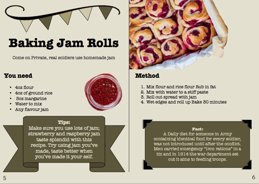
After looking back at the front cover i thought the tiles could be a common trade for the book, with its bunting look - which is very vintage and 1910's within many shades of green i feel this look real expresses the cooking/baking feel. i do feel the layout of the informations should or could be changed and the images will be photos I've taken at the end.


Thing i need to photograph
For aunt betty's pudding, baked jam roll and bread and jam pudding.
- milk bottle
- eggs
- jam
- fruit - lemon
- sugar
- flour
- ground rice
- margarine
- water
24th of April
Next week i plan to have done
- user testing
- do photos for book
- finish all research
- design task or game sheet for children in school at home
So next week i should have finished
- front cover
- double page
- sheet
Design of sheet - game or task


sketches
Mock up, of reward sheet - names can be put on top and they tick the recipes they've done at home - they get reward sticker for 2,4,6 and 8 recipes - maybe they get a free cooking tool at 8 recipes done (dependant on cost).

Over all stickers are cartoon based designs, with bright colours and characters, with funny quotes along side them.

Maze, to get you picked recipe, but there are different levels for different ages.

Final ideas for per review


Per review
Comments from per review to improve in.
- play with other colours
- add history info in double page spread
- change background- less flat
- link more with war
Good comments
- good research
- good work
- good typeface and audience is clear
Experimenting with colours
My original colours were to be soft and welcoming with a hint of army colours. It does look a little too friendly, needs to be darker, more war related.

This colour scheme is based on the English flat colours and the old looking paper colour for background. It seems a little too much with all these colour, often in the 1910's it was 2 tone colours only, i feel because of this it wasn't right for my design. Plus though its English colours its also French and American.

Though this is the same colours, i like the layout more within this design with the picture holders, i love the old themed look it gives.

I love the colours of this design, as its very simpler to my first colours, its more war and army related, its darker but not over whelming. Defiantly more army uniform themed.

I need this isn't linked with any aspirates of world war 1 at all, tho warming and looks old its just isn't themed. Same for the red version, though i thought it would be good to have red as red poppy are the symbol of the war i think it looks too feminised.


Final Colours
After playing around with colours
- I think this colour is more war related
- the typography is clear, old fashion and hand written looked
- The half frames round the images and bold text are shadowed, this makes a contrasted between the background and the images, making it less flat.
- I think my image that i pick and make for the front with make it more historic and war related more, inferencing the colours more too.


Week before hand in.
Fits


 as i was unsure if the cover should have the map background or be plan, i thought this would be a good time for user testing.


Brief!
A WW1 recipe food book for children in school and at home. (review)


final reward chart for school


Fits
- grids_ went over everything making sure its alined and follows a grid system.
- play with bold typography? _ changed typeface to American typewriter, as it fitted my design more - looking older and more war style.
- Brown background seems a bit flat/generic, understand what you're trying to suggest but consider a knocked-back 'texture' from (say) old paper (or) maybe a WW1 Trench map or similar (one or two have used this to help put across the idea of trench warfare etc).. _ change background and experiment with map backgrounds. Of France.
- change text on back over, needs to be level to be readable. _ done - back it straight, and clear.
- add fact on back_ adding facts on back cover and adding fact in pages with tips as well.
http://www.express.co.uk/news/world-war-1/502452/The-Battle-to-feed-Tommy-The-diet-of-a-WW1-soldier
http://www.bbc.co.uk/schools/0/ww1/25245899


I think the book cover, and the reward charts don't need the map background i think it works best for the page layouts.


My photos


My final page layouts


A WW1 recipe food book for children in school and at home. (review)
- double page spread design - size and format again up to me - needs to be synch with the cover design.


- show my work on many medias like tablets and phones.


i want to add a speck button for children that strung reading, being deslexia my self i know its a great help. Children might be more inclined to do it at home if it'd less work for them.
- A book cover design - front and reverse pages and spine - size and fomat to be divided by me based on research. Final cover design


- work sheet design - single page link to each spread design with task and games that children can personalise with name and school etc.


- add any additional features , final stickers


mock up of cover


- PDF version is key
file:///Users/student/Desktop/Jess%20Matthews%20Children's%20book%20design/cover,%20spine%20and%20back%20.pdf
file:///Users/student/Desktop/Jess%20Matthews%20Children's%20book%20design/double%20page%20design%201.pdf
file:///Users/student/Desktop/Jess%20Matthews%20Children's%20book%20design/double%20page%20design%202.pdf
file:///Users/student/Desktop/Jess%20Matthews%20Children's%20book%20design/final%20reward%20chart%20school.pdf
file:///Users/student/Desktop/Jess%20Matthews%20Children's%20book%20design/page%201.pdf
file:///Users/student/Desktop/Jess%20Matthews%20Children's%20book%20design/page2.pdf
file:///Users/student/Desktop/Jess%20Matthews%20Children's%20book%20design/page3.pdf
file:///Users/student/Desktop/Jess%20Matthews%20Children's%20book%20design/page4.pdf
file:///Users/student/Desktop/Jess%20Matthews%20Children's%20book%20design/reward%20chart%20for%20home%20(peronal).pdf
file:///Users/student/Desktop/Jess%20Matthews%20Children's%20book%20design/iphone.jpg
file:///Users/student/Desktop/Jess%20Matthews%20Children's%20book%20design/cover.png
file:///Users/student/Desktop/Jess%20Matthews%20Children's%20book%20design/ipad%20verions%20.png
file:///Users/student/Desktop/Jess%20Matthews%20Children's%20book%20design/ipad%20verisons%202.png
- A2 mount board with a scaled down print out from my PDF file. everything must be label.


Materials
I made sure in the beginning that I
only used pen and paper to get the additional ideas before moving onto digital
versions on over straighter. I also had to use photo shop as I wanted to focus
on photographic based designs which also meant the addition of appropriate
props such as hessian bags and farm house style containers.
Time management
I focused a lot of my time within researching early 20th
century book designs for both children and adults, including cookery books and
also generic book designs from that era. I felt this was crucial in order to
understand and tackle the brief successfully, and to produce a more accurate
final design.
I am happy with my final design, although ideally I would
of liked more time in order to smooth out any issues, for example I feel it
would of been beneficial to have tested the book within a school.